The Place to Disappear Magazine
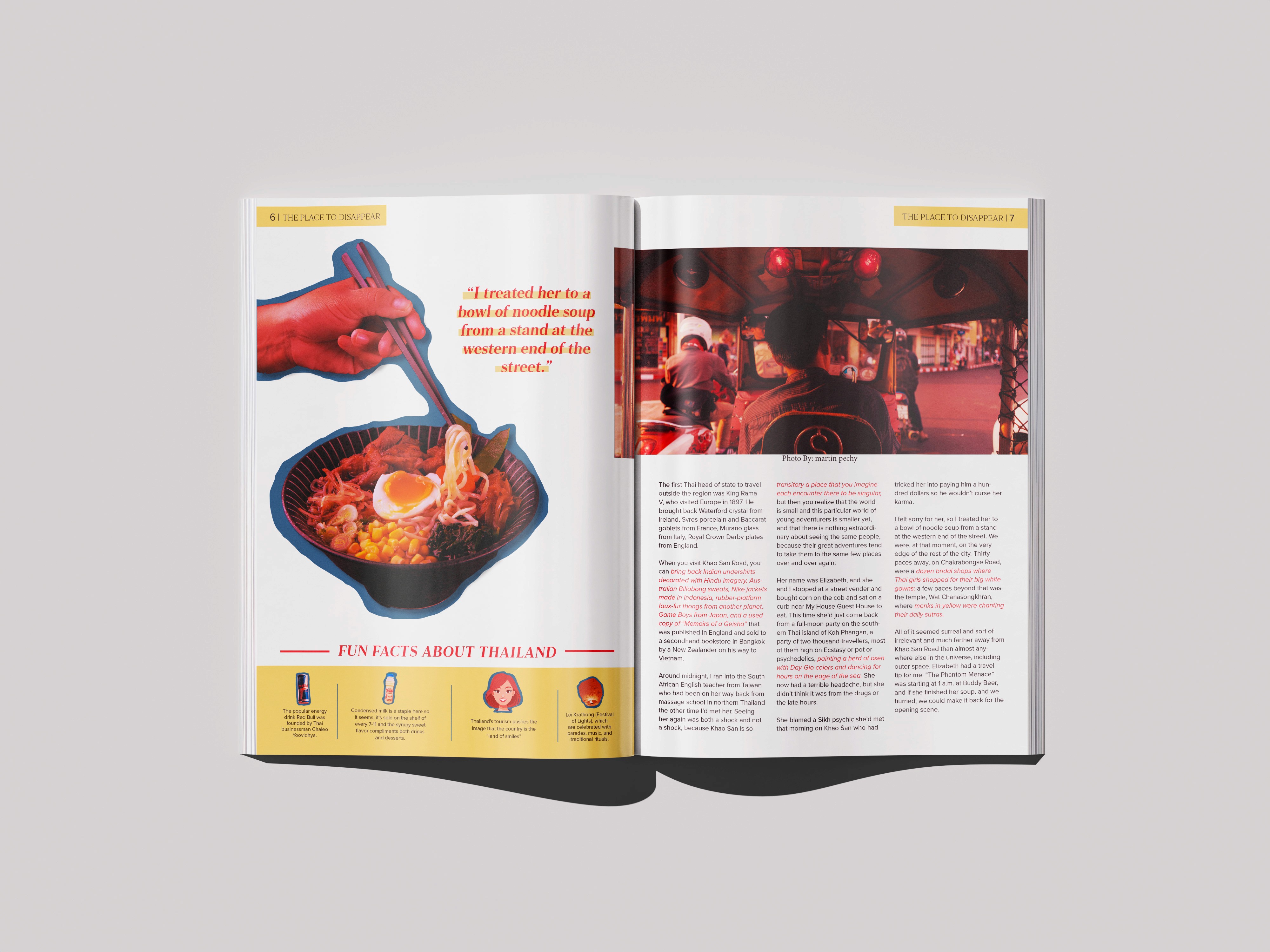
"The Place to Disappear" is a vibrant, multi-page editorial spread designed for a travel and culture magazine. The article takes readers on a visual and narrative journey through South Asia, specifically focusing on Bangkok, Thailand. The design balances a high-energy, contemporary aesthetic with a structured layout to evoke the chaotic, sensory, and beautiful nature of urban exploration. The deep crimson red and warm mustard yellow create a high-contrast, energetic atmosphere that feels distinctly tied to the warmth and street life of Southeast Asia. Soft pinks, muted blues, and neutral tones from the map imagery balance the layout so the bold primary colors don't overwhelm the reader. The headline uses a striking, high-contrast serif font with a modern, editorial edge. The letters are tightly tracked and creatively overlapped to create a sense of density and intrigue, mirroring the theme of getting "lost" in a destination. The Clean, highly legible sans-serif and serif typefaces are used for the body copy and running headers to ensure readability against dynamic design elements. Key phrases within the body text are highlighted in red to draw the eye and break up dense blocks of information.
Client
Self-made Project
DELIVERABLES
Editorial Magazine
Year
2025
Awards